Thứ Sáu, 8 tháng 1, 2016

Banknotes and The Lessons From Their Designs

Todays, internet transaction is invading offline world. However, it is still impossible for our life without paper money or any kind of banknotes. Because paper money is not only the traditional payment method, but also the symbols of societies. Therefore, design of banknotes or paper money is so important that will bring you inspiration and lessons from their designs.

1. Ancient Banknotes in China

Using paper money is as old as paper. Ancient Chinese people use paper to transfer letters of credit for the long distance transaction from 618 AD. They are so cleaver in the way using it and describing them in the paper. This kind of money names fei-chien or “flying money.”
The paper notes which is still maintained todays were issued in the Ming Dynasty in 1368 to 1399. This money size is like a legal document, and they were produced from the recycled gray mulberry bark paper.
Banknotes and The Lessons From Their Designs 01
200 Kwan note is nearly the size of a legal document.
They are really effective in that time. However, by the 15th century, China had to remove paper notes because of high inflation. Such a pity, because Chinese paper money appeared before European, and 3 centuries before it became popular all around the world.

Lesson: Accessibility issue

Although the limited resources and design tools, the Chinese people at that time still can designed a easy understanding product. So, everyone can use or read it. In additional, there is a draw of 2 strings (one holding 10 coins), that's why anyone doesn't know how to read still can understand the value of money they hold.
The paper money was designed with complex patterns, dragons and clouds. This makes the money be unique and difficult to make the fake one.
So, when you work with accessibility, you need to make content be able to perceived, navigated and interacted with any style.

2. US Dollar

The US dollar was issued in the early of 1860s by US Treasury in order to help finance of the Civil War. The portrait of Salmon P. Chase was used to illustrate for this first US banknote.
Banknotes and The Lessons From Their Designs 02
The first dollars had a green on the back. Because American people think that this colour is stability and growth. Therefore, green in the dollars became the traditional colour in the American paper money. Beside, the dollars are also printed with the black colour. However, this colour was criticized because of not being accessible for the visually impaired.
Banknotes and The Lessons From Their Designs 03
The US Educational Series banknotes in 1896 is the most beautiful paper money design in USA. However it was given up because of of controversy due to the classical female figure depicted on it.
Banknotes and The Lessons From Their Designs 04
$20 Federal Reserve note, 1928.
The next dollar design was also critisized in the media for a lack of aesthetic and legibility. Michael Bierut wrote in The Atlantic magazine: “Anyone trying to understand our national values would be baffled by the rococo Victoriana and Masonic mumbo jumbo that festoon a dollar bill.”
The current $100 dollar is the newest banknote issued on 10/2013. It is better in design and accessibility. This “Benjamin” dollar got the special anti-counterfeiting features, one of them is the complex effect when the dollar is exposed to light directly.
Banknotes and The Lessons From Their Designs 05
The updated 100 USD banknote
Althought, Benjamin Franklin’s portrait appears in so many banknotes from 1914. Brian Thompson’s design focus on the other aspects of Benjamin's looking. So, inkwell and script from the Declaration of Independence was added to remind American that Franklin is the one of people who design and edit the Declaration
Banknotes and The Lessons From Their Designs 06
From 2009, because of the US recession, Richard Smith called everyone to join to design the US currency. And the submissions from enthusiasts continue to come from all over the world.
Banknotes and The Lessons From Their Designs 07
US currency redesign by Travis Purrington.
Banknotes and The Lessons From Their Designs 08
US currency design concept by Mucho
.

Lesson: Redesign Wirely

The US currency history proves that redesigning is more difficult than designing from the beginning. Because people are usually afraid of that the new one is less effective, so they often avoid the huge changes. However, it seems safer because redesigning can inherit the strong points from the original one.

3. Notgeld: German banknotes

Notgeld (emergency money) was issued by the other body, not centre bank. They was printed in the hyper inflation period.  (World war I). It was not only the bill, but also the a powerful force for raising the spirits of a desperate society although banknotes were printed almost nightly in every area.
Banknotes and The Lessons From Their Designs 09
Almost Notgeld design based on history and historical subjects and heraldic images to remember the unlucky past. While the rest (one desined by Herbert Bayer) was minimal, modernist aesthetic to give people motivation to create the better future.
You can see that Notgeld if the golden mine for anyone loving typography
Banknotes and The Lessons From Their Designs 10

Lesson: lound visuals draw attention

A impressive looking can be achieved by mixing colours, contrast, gradients, as well as using ornate item to make sure that your design is still attractive although it's not on the top page.

4. European banknotes

The European Monetary Institute (EMI) started a competition for designing the European paper money in 2/1996. This design is the big challenges for designers because it will be used in 28 countries. So, there was no bias in this competiton. All design was required to be easy to recognize, secure against counterfeiting and aesthetically attractive, not to mention accessible to people with impaired vision.
After 7 months, the EMI’s council chose the winner. The design belong to the Australian guy Robert Kalina. He designed the bill based on the “ages and styles of Europe”. Each feature represent for a period of European history.
Banknotes and The Lessons From Their Designs 11
The banknotes changed a litle bit in design 5/2013 and enhance security
Banknotes and The Lessons From Their Designs 12
All the design process included a survey for everyone to choose the most suitable features and design. Although the European banknote design is not the most impressive, it is an excellent balancing of everyday objects and the uniqueness of this social symbol.
Size of the wallet is one of the hundreds design right after designing the banknotes.
Banknotes and The Lessons From Their Designs 13
Banknotes and The Lessons From Their Designs 14

Lesson: The universal design approach

European banknote is the standard example for global design. These design need to include a cultural and political message and accessibility features. Furthermore, it also need to be suitable for user's expectations, highlights the most important things and remove the  unnecessary complexity.

5. Swiss Franc banknotes

Swiss Franc is the most secure banknote and the most in this world. Each banknote is a piece of art with numbers and labels. 8 series of Swiss franc bills were printed since 1907. Each series were design with different size and colour. All of them were focus on elaborate layouts, typography and colour.
Banknotes and The Lessons From Their Designs 15
Banknotes and The Lessons From Their Designs 16
All 8 series have to adopt by5 countries: Mexico, Colombia, Bermuda, Venezuela and Nicaragua after it's issued.
Banknotes and The Lessons From Their Designs 17
Manuel Krebs won the design competition in 2015 for the ninth banknote series. He attempted to enhance  human factor by incorporating emotion into it. However, it was criticized because of the blood cells and embryos design.
Banknotes and The Lessons From Their Designs 18
Therefore, the Swiss National Bank chose the second one designed by Manuela Pfrunder..
Banknotes and The Lessons From Their Designs 19
Manuela Pfrunder’s design
 

Lesson: Paying attention to orientation

Focus on the vertical and horizontal positions because this will help designers so much on providing content. When you design the orientation of a theme or anything else, consider to the priority of the content throughout materials or devices.

6. Norwegian Krone

In 10/2014 Norges Bank (Norway’s central bank) also launched the design competition for the new banknote series.
Banknotes and The Lessons From Their Designs 20
One of the necessary feature in the design is security. So designers incorporate numerous anti-counterfeiting features in their concepts.
Banknotes and The Lessons From Their Designs 21
Metric System’s design brought the abstract classic appearance with the features of sea: ships, fish, a lighthouse and people resting by the sea.
Banknotes and The Lessons From Their Designs 22
Design concept by Snøhetta Design.
The rainbow in the new design seems to blow the new wind for this krone. Along with guilloches, it was the strongestsecurity features of Norwegian banknotes. However, this technique has been abandoned because of  the development of other printing methods, such as: traps, screen, or scan
Banknotes and The Lessons From Their Designs 23
The colors of the new krone are adjusted to blend from one bill to another, a symbol of the Norwegian coastline.
Norway's banknote design is so ingenious on many levels. For example: smart connection between the past and present or the seamless blend of classic and avangarde. So it can be a symbol for  country’s values to both citizens and the world.

Lesson: Embrace constraints

Like many banknote design, The Krone has many limitations. However, it's the chance for designer to embrace constraints and make a creation.
When make a design with many limitations, just see it as a guidelines, so you will feel it much easier. Keep your mind always open, the breakthrough will come to you soon.

Learning From Banknkotes Design

To recap, here are lessons we can learn from banknotes design
  • Accessibility is important
  • Redesign wisely
  • Loud visuals draw attention
  • Consider a universal design
  • Pay attention to orientation
  • The Swiss franc set the trend for portrait orientation in banknotes.
  • Embrace constraints
You may interested in
The Best Cutting Edge Book Design in 2015
Web Design & Development Trends in 2015. What’s next in 2016?

Thứ Tư, 6 tháng 1, 2016

The Best Cutting Edge Book Design in 2015

There is an annual competition to choose the best Cutting Edge Book Design in a year.This is the oldest competition in United State which was launched in 1923 by the American Institute of Graphic Arts, but from 2015, it's hosted by Design Observer. This year is the first time all winners will be in a book and in a touring exhibition with Dave Eggers' introduction.
Jessica Helfand - Design Observer editor - said: "“What’s interesting about the annual competition is that it becomes a cultural snapshot of a value system and a set of visual vocabularies, fascinating for people who care about books and book design.”
Let's see the best designs she chose in 2015.
The Best Cutting Edge Book Design in 2015 01
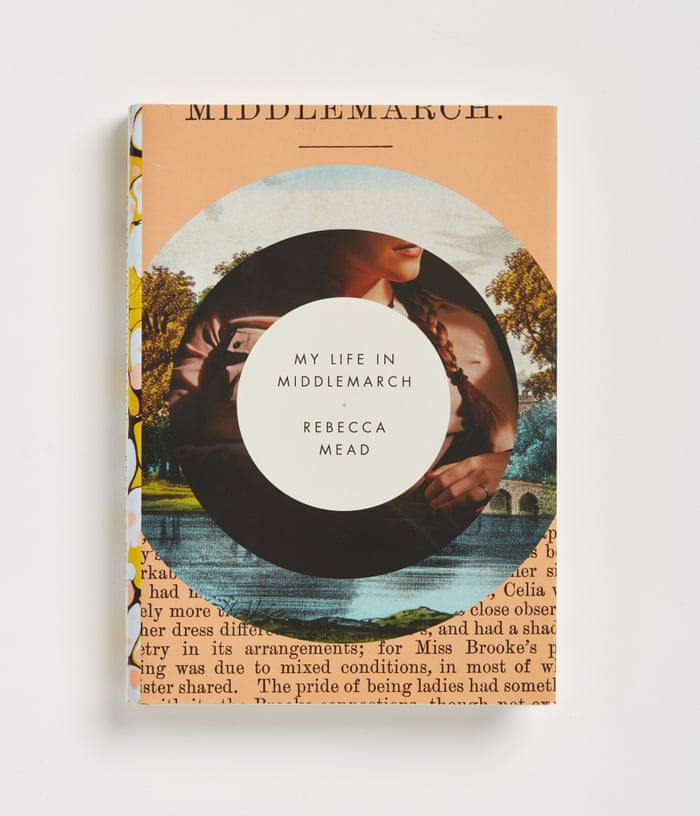
Elena Giavaldi’s cover for Rebecca Mead’s My Life in Middlemarch“lovingly gestures to the multiple orbits of the author’s memories of one seminal book.” Photographer: George Baier IV
The Best Cutting Edge Book Design in 2015 02
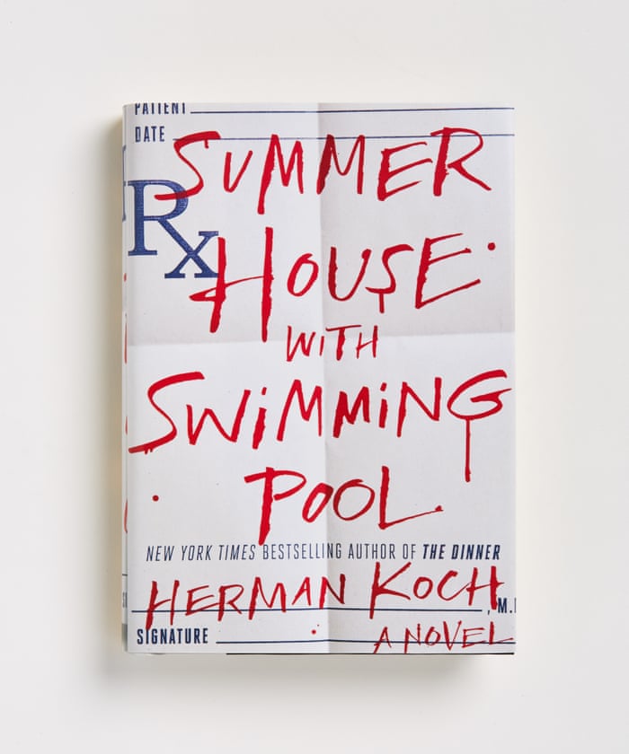
Chris Brand’s cover captures “a summertime murder mystery about a medical procedure gone awry.” Photographer: George Baier IV
The Best Cutting Edge Book Design in 2015 03
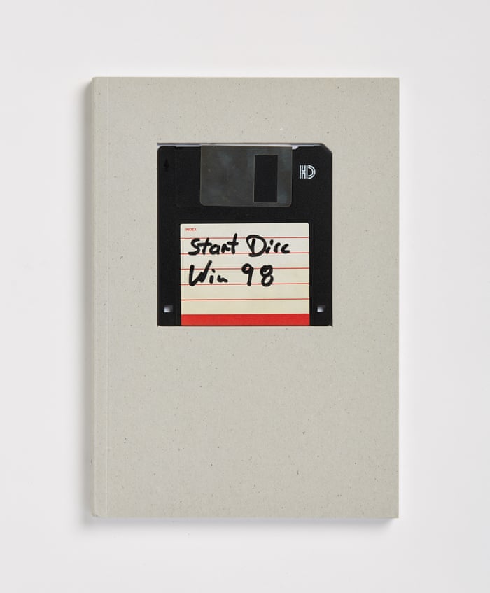
“A die-cut, recessed rectangle provides a perfect frame for an old-school floppy disk, creating a ‘when worlds collide’ formal approach to a book about” post-digital media, called War postdigital besser? (Was postdigital better?) Photographer: George Baier IV
The Best Cutting Edge Book Design in 2015 04
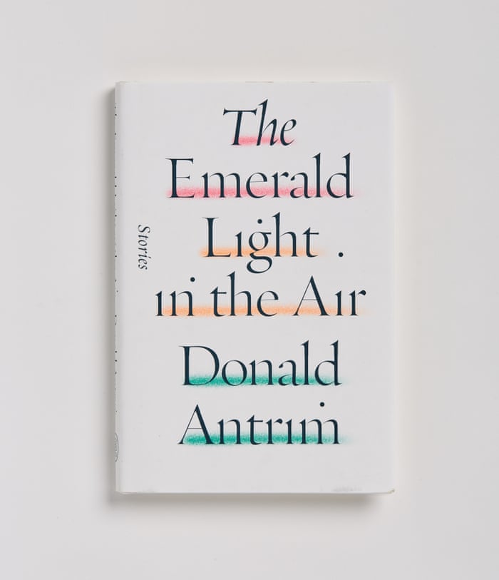
“Rodrigo Corral’s elegant cover” illustrates The Emerald Light in the Air. Photographer: George Baier IV
The Best Cutting Edge Book Design in 2015 05
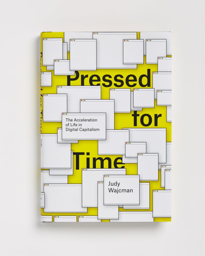
“A pitch-perfect cover for a book on digital capitalism, Pressed for Time, with cartoon renderings of colliding windows.” Photographer: George Baier IV
The Best Cutting Edge Book Design in 2015 06
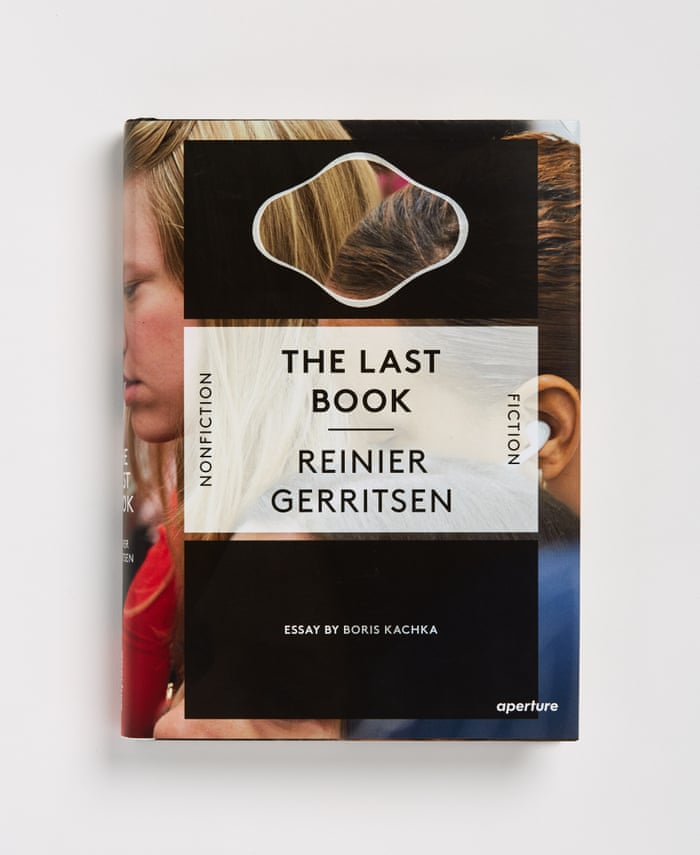
“A book in a book in a book: here, cutouts dodge a photograph, cropped aggressively yet without losing important information. The type is straightforward and elegant, centred and serious as befits the subject matter: it’s a book of photographs of people reading.” Photographer: George Baier IV
The Best Cutting Edge Book Design in 2015 07
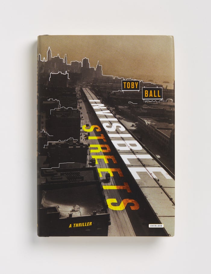
The cover by Anthony Morais for Toby Ball’s thriller Invisible Streets“suggests a kind of bibliographic film noir. Typography arching forward, grey shadows overlapping buildings, the jurors found this book perfect for its subject matter.” Photographer: George Baier IV
The Best Cutting Edge Book Design in 2015 08
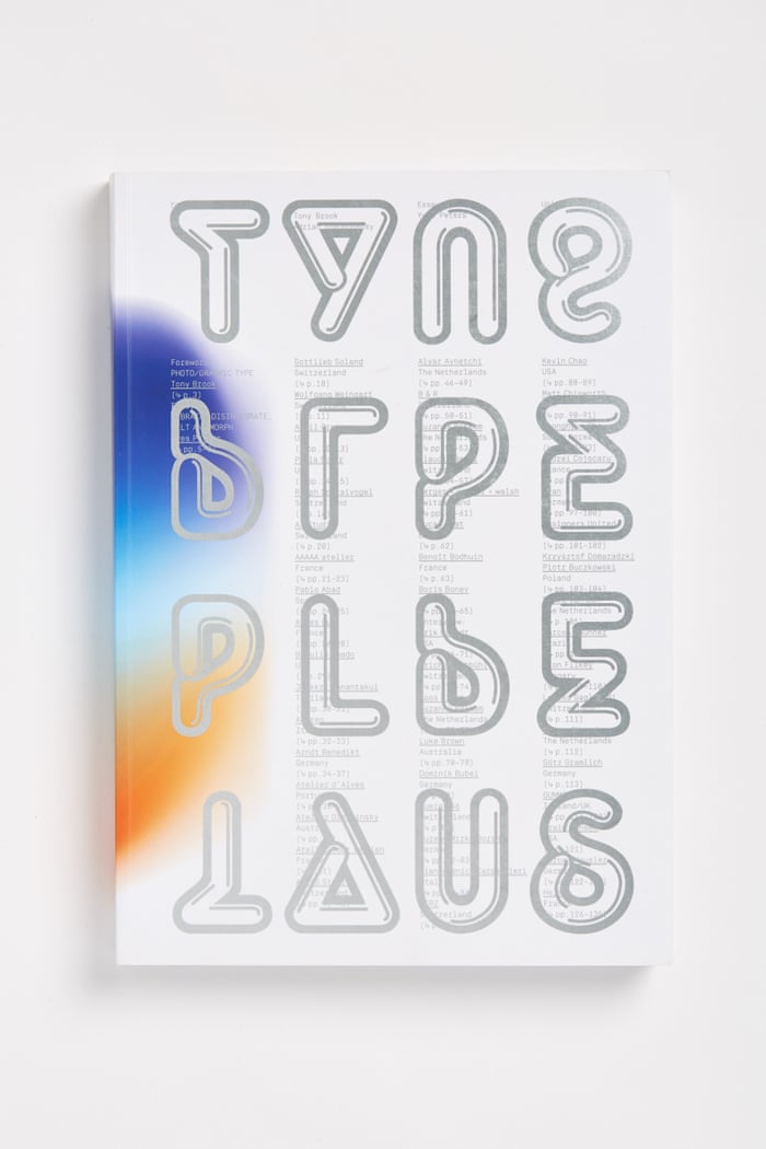
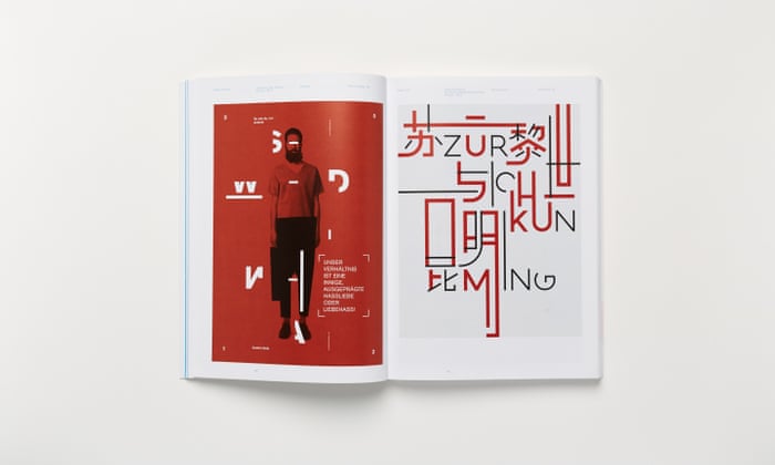
“Designers Claudia Klat and Tony Brook – a partner, with Adrian Shaughnessy, in Unit Editions, the London-based publisher – produced this dynamic cover for a compendium on new work in typography. It uses silver metallic ink on top of columns of text. A winning entry in both books and covers, inside spreads are devoted to posters and interviews.” Photographer: George Baier IV
The Best Cutting Edge Book Design in 2015 09
“Inside the book, transcripts from interviews sit opposite examples in which typography combines with image in new and unusual ways.” Photographer: George Baier IV
The Best Cutting Edge Book Design in 2015 10
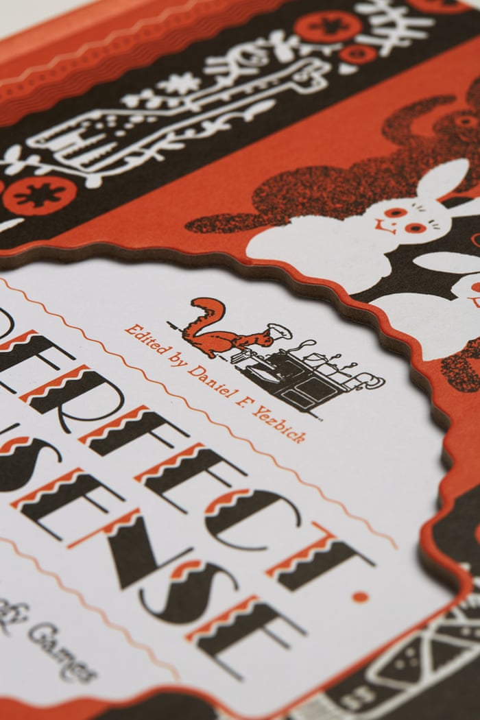
“Designer, illustrator and cartoonist George Carlson (1887–1962) was a prolific visual satirist whose work has been brilliantly gathered in a new book designed by Tony Ong. Gesturing to the playful ornament – dots and dashes, rules and borders – the book includes a die-cut cover and elegant reproductions from Carlson’s prodigious portfolio.” Photographer: George Baier IV
The Best Cutting Edge Book Design in 2015 11
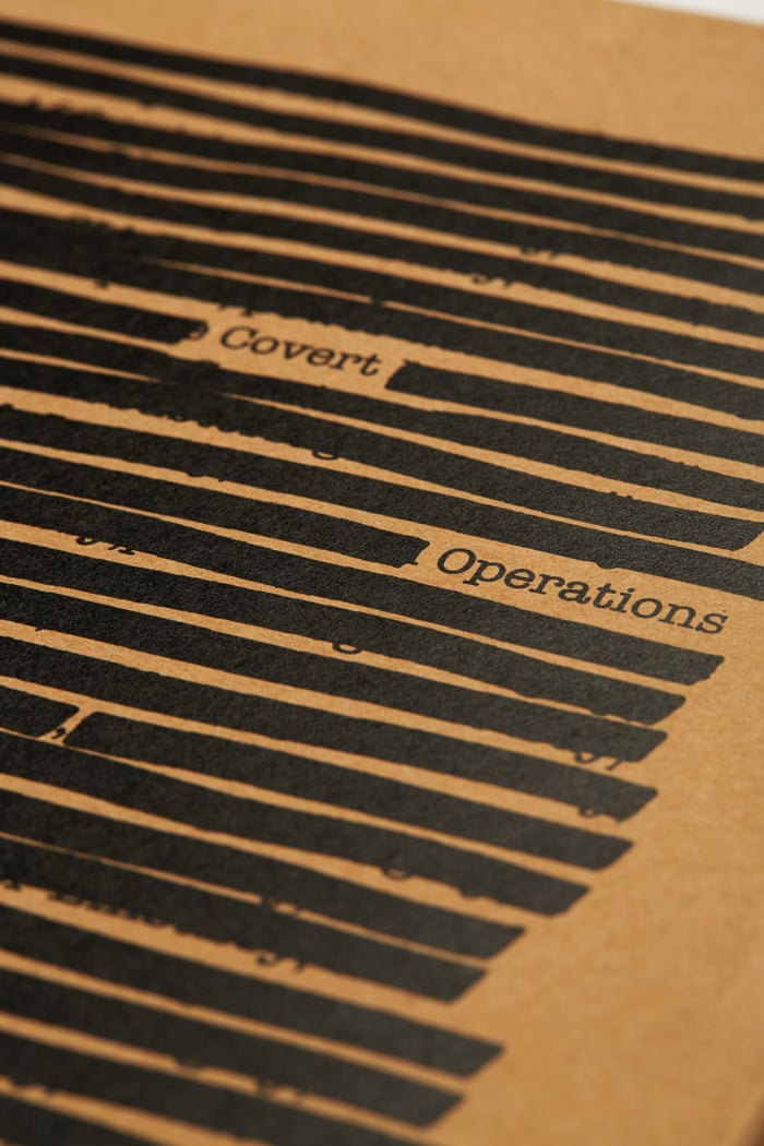
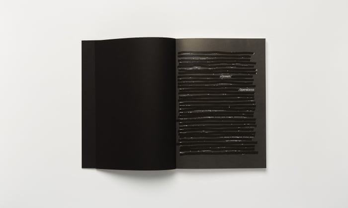
“Deploying redaction as a visual conceit, designer David Chickey plays with concealing and revealing information for a book titled Covert Operations: Investigating the Known Unknowns. The book testifies to the idea that great ideas can be executed with a minimum of means and materials. Less, in this case, is very much more.” Photographer: George Baier IV
The Best Cutting Edge Book Design in 2015 12
The Covert Operations' interior detail pages. Photographer: George Baier IV
 You may interested in:
10 The Best Book Store WordPress Themes In The World
BEBO – The Unique Way To Create Your Amazing Book/Disk Store
BEBO – The Best Marketing Solution For Upcoming Products

Wordpress Plugins Still Standing on Top Popularity of 2016

There are hundreds of Wordpress plugins released every year. However, just few of plugin most people use because of its uses and quality. Therefore, they are still the most popular ones in 2016. Let's figure out who they are.
Wordpress Plugins Still Standing on Top Popularity of 2016 01

1. Akismet

Wordpress Plugins Still Standing on Top Popularity of 2016 02
Akismet is an amazing plugin to manage comments in your site. This plugin has ability to recognize spams, even know the negative or positive comments. From that, it just keep the helpful comments on your site, and remove another if you set in the beginning time.
One more great feature, you can use Akismet to spam the user commenting on your website without deleting them. It's so great, isn't it?

2. Floating social media sharing plugin

Wordpress Plugins Still Standing on Top Popularity of 2016 03
You know, todays, social media is so crucial to create a viral products/items with the minimum cost. And social sharing is the most important thing. This is much easier by the plugin to enhance this, it is Floating Social Share bar Wordpress plugin. You also can empower or impair any of the plugin’s positions.

3. Jetpack

Wordpress Plugins Still Standing on Top Popularity of 2016 04
Jetpack plugin allow you to redo a website including content, login security, observing content, even know all the client of the site. However, there is a small issue, this plugin makes your website heavier to stack

4. Wordfence Security

Wordpress Plugins Still Standing on Top Popularity of 2016 05
Wordfence Security is one of the most dowloaded plugins on Wordpress. This plugin is to protect your site from the malware, therefore, your website can be optimised speed. The great thing is that Wordfence Security is totally free, however, you also can take the premium one like: Country Blocking, Scheduled Scans, and Password Auditing... Its responsibility is your website's security.

5. WooCommerce

Wordpress Plugins Still Standing on Top Popularity of 2016 06
If you are planning to build a e-Commerce website, WooCommerce plugin is the best choice. It has the perfect coordination with Paypal in order that customer can buy products in the site from all over the world. This plugin is all for an online shop including surveys and deals reports, simple coupon accommodation, different delivery techniques...

6. W3 Total Cache

Wordpress Plugins Still Standing on Top Popularity of 2016 07
Speed of a website is extremely important. And every coders want to optimise their website's speed. If you are looking a plugin to do that for you, you should consider W3 Cache Plugin. Besides increasing website speed, this wordpress plugin also help you for browser caching and compress pages in order that enhance speed of downloading and browsing web pages in your site. Don't mind about its price, FREE on wordpress ;)
You may interested in:
How to Fix Fatal Error: Maximum Execution Time Exceeded in WordPress
WordPress 4.4 “Clifford”
Calypso is WordPress’ Latest Update Utilizing JavaScript

Thứ Hai, 4 tháng 1, 2016

The Best Cutting Edge Book Design in 2015

There is an annual competition to choose the best  in a year.This is the oldest competition in United State which was launched in 1923 by the American Institute of Graphic Arts, but from 2015, it's hosted by Design Observer. This year is the first time all winners will be in a book and in a touring exhibition with Dave Eggers' introduction.
Jessica Helfand - Design Observer editor - said: "“What’s interesting about the annual competition is that it becomes a cultural snapshot of a value system and a set of visual vocabularies, fascinating for people who care about books and book design.”
Let's see the best designs she chose in 2015.
The Best Cutting Edge Book Design in 2015 01
Elena Giavaldi’s cover for Rebecca Mead’s My Life in Middlemarch“lovingly gestures to the multiple orbits of the author’s memories of one seminal book.” Photographer: George Baier IV
The Best Cutting Edge Book Design in 2015 02
Chris Brand’s cover captures “a summertime murder mystery about a medical procedure gone awry.” Photographer: George Baier IV
The Best Cutting Edge Book Design in 2015 03
“A die-cut, recessed rectangle provides a perfect frame for an old-school floppy disk, creating a ‘when worlds collide’ formal approach to a book about” post-digital media, called War postdigital besser? (Was postdigital better?) Photographer: George Baier IV
The Best Cutting Edge Book Design in 2015 04
“Rodrigo Corral’s elegant cover” illustrates The Emerald Light in the Air. Photographer: George Baier IV
The Best Cutting Edge Book Design in 2015 05
“A pitch-perfect cover for a book on digital capitalism, Pressed for Time, with cartoon renderings of colliding windows.” Photographer: George Baier IV
The Best Cutting Edge Book Design in 2015 06
“A book in a book in a book: here, cutouts dodge a photograph, cropped aggressively yet without losing important information. The type is straightforward and elegant, centred and serious as befits the subject matter: it’s a book of photographs of people reading.” Photographer: George Baier IV
The Best Cutting Edge Book Design in 2015 07
The cover by Anthony Morais for Toby Ball’s thriller Invisible Streets“suggests a kind of bibliographic film noir. Typography arching forward, grey shadows overlapping buildings, the jurors found this book perfect for its subject matter.” Photographer: George Baier IV
The Best Cutting Edge Book Design in 2015 08
“Designers Claudia Klat and Tony Brook – a partner, with Adrian Shaughnessy, in Unit Editions, the London-based publisher – produced this dynamic cover for a compendium on new work in typography. It uses silver metallic ink on top of columns of text. A winning entry in both books and covers, inside spreads are devoted to posters and interviews.” Photographer: George Baier IV
The Best Cutting Edge Book Design in 2015 09
“Inside the book, transcripts from interviews sit opposite examples in which typography combines with image in new and unusual ways.” Photographer: George Baier IV
The Best Cutting Edge Book Design in 2015 10
“Designer, illustrator and cartoonist George Carlson (1887–1962) was a prolific visual satirist whose work has been brilliantly gathered in a new book designed by Tony Ong. Gesturing to the playful ornament – dots and dashes, rules and borders – the book includes a die-cut cover and elegant reproductions from Carlson’s prodigious portfolio.” Photographer: George Baier IV
The Best Cutting Edge Book Design in 2015 11
“Deploying redaction as a visual conceit, designer David Chickey plays with concealing and revealing information for a book titled Covert Operations: Investigating the Known Unknowns. The book testifies to the idea that great ideas can be executed with a minimum of means and materials. Less, in this case, is very much more.” Photographer: George Baier IV
The Best Cutting Edge Book Design in 2015 12
The Covert Operations' interior detail pages. Photographer: George Baier IV