Colour is one of the most important elements in any design to give the attractive message to every audiences or tell an amazing story. If the colour combinations is unreasonable with the pale colours, your message will be ignore despite of its quality. Even NASA also focus on the colour in their tools.

1. The colour's importance in website design
Colour affects to every people in both psychologically and physically. Colour also can influences on their mood and their health.
Each colour has a different meaning. So, designers have to be carefully in using colour to convey their messages to audiences. Therefore, The best solution a any design is not personal colour.
2. Contrast colour in website design
Colour contrast is so crucial when designing a website. Because it can bring user exactly what you want to message them. That is the reason why designers are usually hesitate while they're making a creative product. So, limited colour is the biggest fear of any designer. And designers should make it clear at the beginning.
Colour's combination
It seems that a design look great with the reasonable combination. However, the combination depends on so many elements. For example: higher contrasts looks more interesting for myope, and differences and subtle tones will be appreciated by difficult reading people.
The perfect combination of colour contrast
It is necessary for designer to pay attention to colour contrast techniques. If a designer knows how to use contrast competently, she/he is nearly to the successful one.
The colour which is the most impressive in a design is decided by contrast. If you are working with text, you can make the important text highlight from the rest, or, you can nearly remove anything from the background by using colour.
That means the proper contrast can help the readers catch the text they want in the sea of information.
So, contrast is important. Keep that in mind!
To be honesty, people will glance at your design rather than reading content. They are just to be attracted by eye-catchy letters, shapes, and images appear strongly in your design.
So, to keep your design in their mind, it totally depends on your contrast strategy.
Low Contrast and High Contrast

High contrast is the best way to make an item standing out from the rest. Dar colour in the light backgrounds or vice versa, it's easier for people to read it. Although, it's not the perfect design, it's reasonable. However, you should carefully with strong contrast, because it can make your users are confused and your design is not clear.
If you want to use low contrast, make sure that the content in design is not important and not necessary to read. For sure, low contrast is not attractive.
The colour's meaning
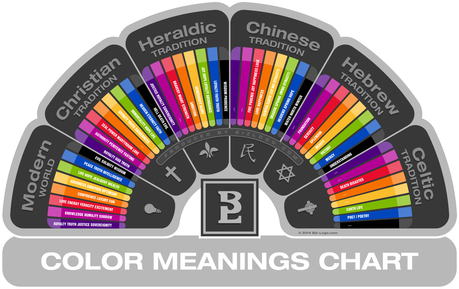
Before using contrast, you should choose the main colour for your creative product. And ơn of the important thing influent to your design is the meaning of a colour. Although colour meaning is not the same in the different cultures, we still can use some useful guideline.
First of all, remember to research the colour meaning with your target audiences. Because sometimes, this colour is happiness of a region, but it's the sadness of another.

Warm colours: red, orange, yellow. They are colour of happy and cozy feeling. They are also a symbol of energetic, passionate or impulsive people.
Cool colour: green, blue, purple. Their meaning is trust, reliability and professionalism. However, be careful with these colour, because they can make your users trust you or the reason causing their sadness and monotony.
Summary on contrast’s importance
- Colour is one of the greatest way to bring your message to your audiences
- Colour contrast is so crucial to make textual content stand out or be lost in a crowd
- Contrast is not only about dark and light tones
- Pay attention to the colour meaning of your audiences
You may interested in:
Không có nhận xét nào:
Đăng nhận xét